Data Analysis/Coding Projects
Astronomy is one of the fields where big data and advanced computational techniques are becoming increasingly important. I dedicate some of my time building data analysis skills. Here I present some of the projects I have done as part of Udacity NanoDegree programs. These programs are designed by Google/Facebook/MongoDB/Airbnb to teach cutting-edge industrial machine learning tools and coding practices, which I have found are very applicable to Astronomy.
Here is a certificate for the Data Analyst Nanodegree course (it took eight months to complete concurrently with my grad school work):

The syllabus for this course can be found here. Below are some non-astro related projects that I have completed with Udacity.
Machine Learning Project: Enron Dataset
In 2001, one of the biggest companies in the world, Enron, collapsed due to corruptions within the company. There is a documentary about people who were responsible for the collapse, called the Smartest Guys in the Room. The goal of the machine learning project was to train a machine learning code to go through the salary/investment information of 145 employees/investors, and find out the architects of the collapse, or the persons of interest (pois).
The tools provided are support vector machine (SVM), decision trees, random forests, adaboost, and even simple neural networks. To complete the project, the participant has to test each of the information available (features) to select principle components, or combine/scale them to produce more responsive features.
The final project is documented here.
The git link to the project code is here.
Data Wrangling Project: Orlando OpenStreet Map Data Cleaning
OpenStreet Map is an open source map where users enter data about places. This project invovled importing data from OpenStreet Map database in XML format (similar to HTML). As user provided data in such interfaces can be peculiarly defined and sometimes erroneous, I had to clean the raw input and create a queryable sqlite database from it. I chose to clean the data of Orlando, Florida as I like to visit Harry Potter World in that city.
Here is the Jupyter notebook of that project.
Data Visualization: Swing State Donation Patterns - Florida, 2016
This project allowed me to work with donation data in any state for any presidential election since 2000. I chose to look with donations data in Florida in 2016, because it was a swing state that kept changing from red to blue and back again right up until election day. I found some interesting patterns while creating these visualizations.
Data Visualization: Titanic Survivor Statistics
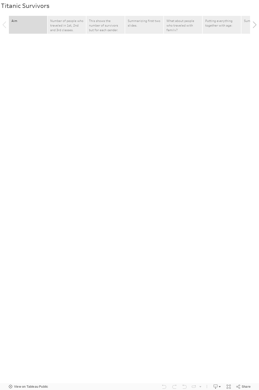
This project involved looking into the data of survivors and non-survivors of the Titanic tragedy, and exploring the data using Tableau visualizations. Here is the final presentation.